Au Naturel Suds + Scents Branding

Au Naturel is a conceptual passion project I created in 2020. My goal was to design a minimal bath and body brand. This project was a great way to showcase my wellness brand skills and attract clients who would like their wellness brand to be in a similar style.
The brand’s mission it to promote natural beauty with clean, minimal + organic bath + body products.
The why behind the brand is for everyone to feel like a bathing beauty when using these products and know that they are good for their body and for the environment.
The goal of the identity design is to emphasize an effortless, sophisticated and elevated bath + body brand through a neutral color palette + minimalistic design.
Brand Profile & Purpose
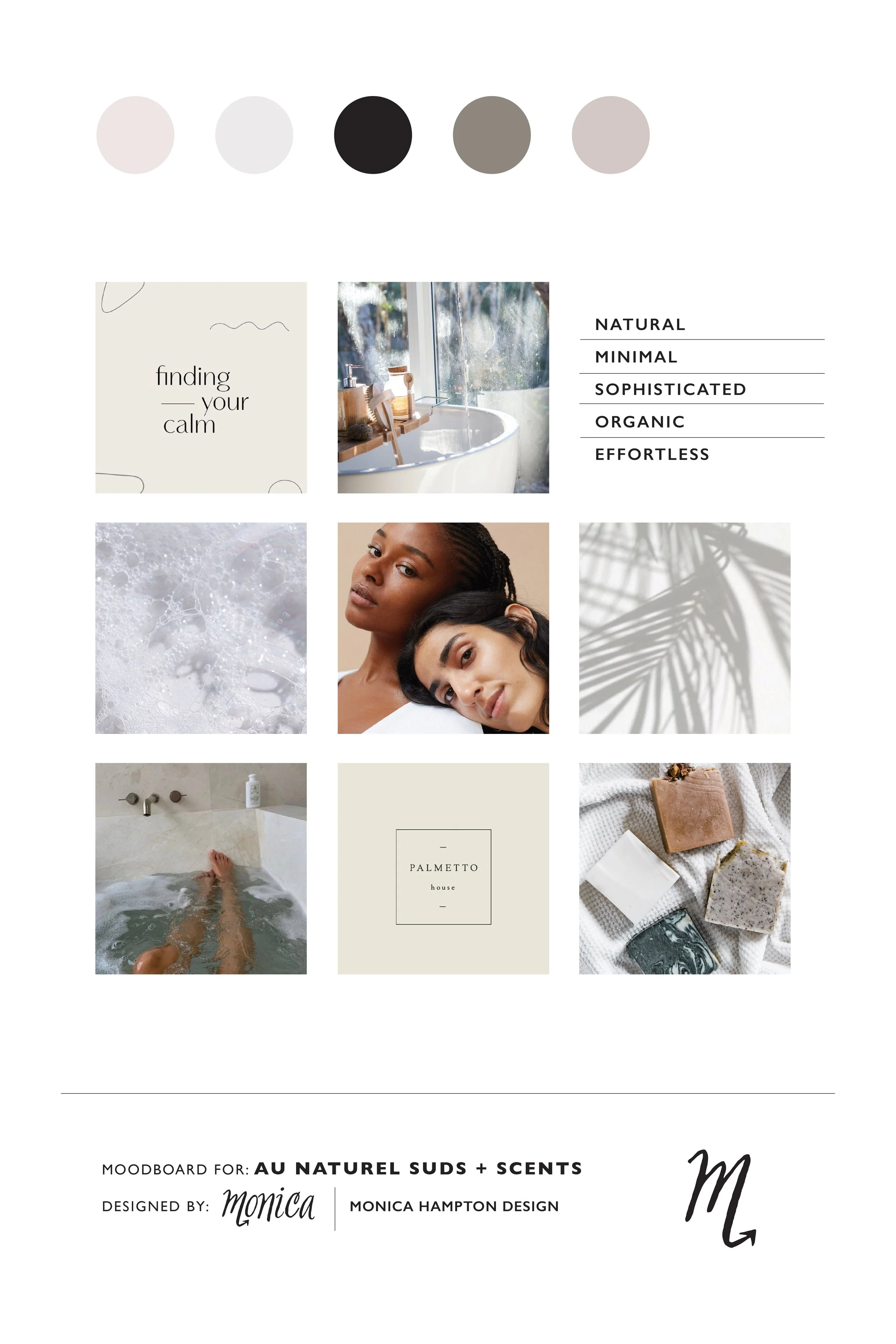
Au Naturel is an all natural French bath + body company specializing in luscious soaps + luxurious scents. The products are clean, minimal + organic to align with the mission of natural beauty.
The french name translates to “in the natural” (in the nude.) A soft, neutral color palette + organic elements + minimalistic design show this brand is effortlessly sophisticated + elevated.
Au Naturel is suitable for all skin colors and textures. This brand includes products for every skin type with no harsh chemicals. The elevated and unique scents paired with each product will not irritate the skin and is subtle enough to give off a light scent.

Design Concept & Direction
A nude color palette and minimal design served as the base for this brand’s identity design. Hand-drawn elements add texture to the brand and resemble the fluid motion of water. A clean sans-serif font paired with a hand-drawn script that matches the brand elements ties everything together to show this brand is elevated with high quality products.
Bright photography and minimal packaging further emphasize the overall brand and the identity design. Shades of nude symbolize skin tones and sketchy hand-drawn elements show an effortlessness that only using this brand’s products will make you feel as you bathe.
Logo Explanation
The primary logo is inspired by Chanel No. 5 and the numero sign.
The secondary logos are variations of the primary logo in different formats.
The submark is a very simplified typographic mark with just the au over the capital N in a square. Resembles a periodic table element.


Hi, I’m Monica
Graphic Designer & Illustrator + Scorpio based in San Diego, CA.
My passion is all things design. I want to inspire you to infuse design into your everyday lifestyle so you can design a life you love.
*CATEGORIES*


13 Going on 30 inspired photoshoot for my 30th birthday!