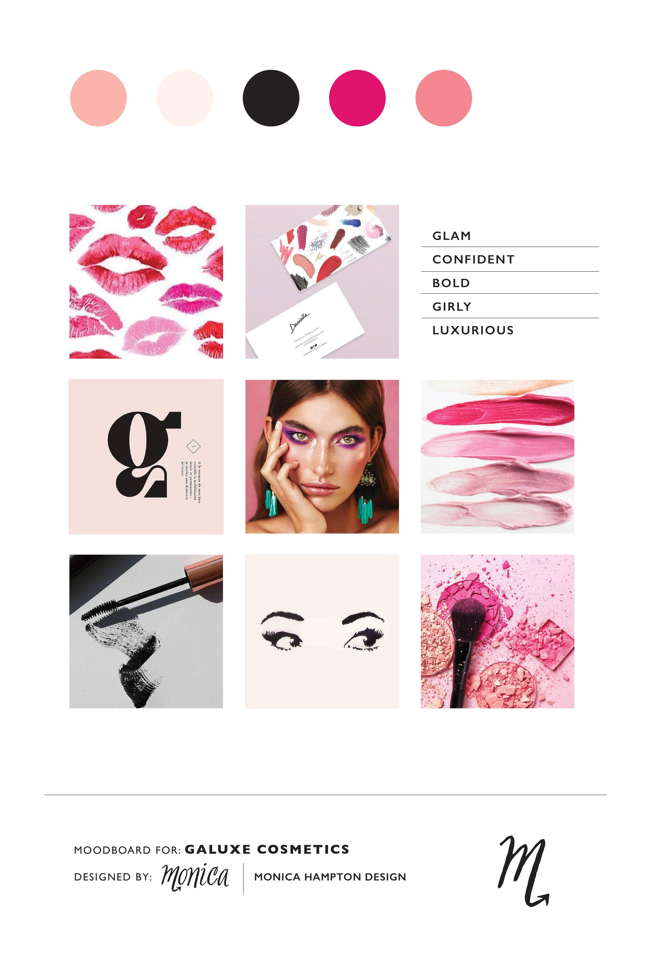
Galuxe Cosmetics Branding

Galuxe Cosmetics is a conceptual passion project I created in 2020. My goal was to design a girly + edgy and unique + creative makeup brand. This project was a great way to showcase my beauty brand design skills and attract clients who would like their beauty brand to be in a similar style.
The brand’s mission it to make every woman feel confident and empowered with fun, bold makeup for a glam look.
The why behind the brand is for women to play around and experiment with fun makeup for glamorous looks. Makeup enhances and empowers, it’s not to cover up.
The goal of the identity design is to stand out among the other competing makeup brands. To be unique, creative, bold in all brand aspects and to bring attention to the brand.
Brand Profile & Purpose
Galuxe is luxury makeup for the stellar glam gal in every woman. Makeup with luxurious quality and an affordable price tag. This brand strives to make every woman feel confident and empowered. When it’s time to get all dolled up, Galuxe products will help you achieve your perfect glam look. Go ahead, glow up girl.
Gal (girl) + Luxe (luxury) = GALUXE
Combining fonts, playing with makeup marks and adding in shades of pink depict a classic makeup brand, but with a twist of uniqueness and creativity.
Every girl can be a glam girl within their budget. A sophisticated and edgy brand design attracts young women who want to feel confident and empowered with their makeup. A luxurious makeup brand that is affordable without sacrificing quality.

Design Concept & Direction
Combining fonts, playing with makeup marks and adding in shades of pink depict a classic makeup brand, but with a twist of uniqueness and creativity. Bold, colorful high quality makeup that makes a bold statement needs a bold brand identity design.
The purpose behind the brand needs to show through in the design. Shades of pink paired with black has a feminine vibe and hints at a girly, bold, edgy makeup brand. The skinny to large typography in the logo shows the transformation of what is feels like to wear Galuxe Cosmetics. The unique and detailed look of the fonts makes the products stand out. Paired with marketing photography, the Galuxe logo will always match the makeup worn by the model.
The bold and playful vibe is shown through makeup smudge marks as design elements within the logo and applied to other brand applications for consistency. Highlighting key makeup items such as mascara, lipstick and lipgloss, these elements are displayed across print and digital mediums.
Logo Explanation
The primary logo showcases a lip kiss mark in the g, eyelashes under the U which represents an eyelid and a mascara smudge swooshed over the top of the logo. This playful logo depicts playing with makeup to create a bold look.
The secondary logos are simplified variations. One with the bottom eyelashes, one with no makeup marks added and one with no makeup marks paired with “cosmetics” in smaller print below the logo.
The submark is the lipstick lowercase g from the primary logo. The circle is the main shade of pink from the color palette and it resembles the shape of lipstick tubes and eyeshadow pots.


Hi, I’m Monica
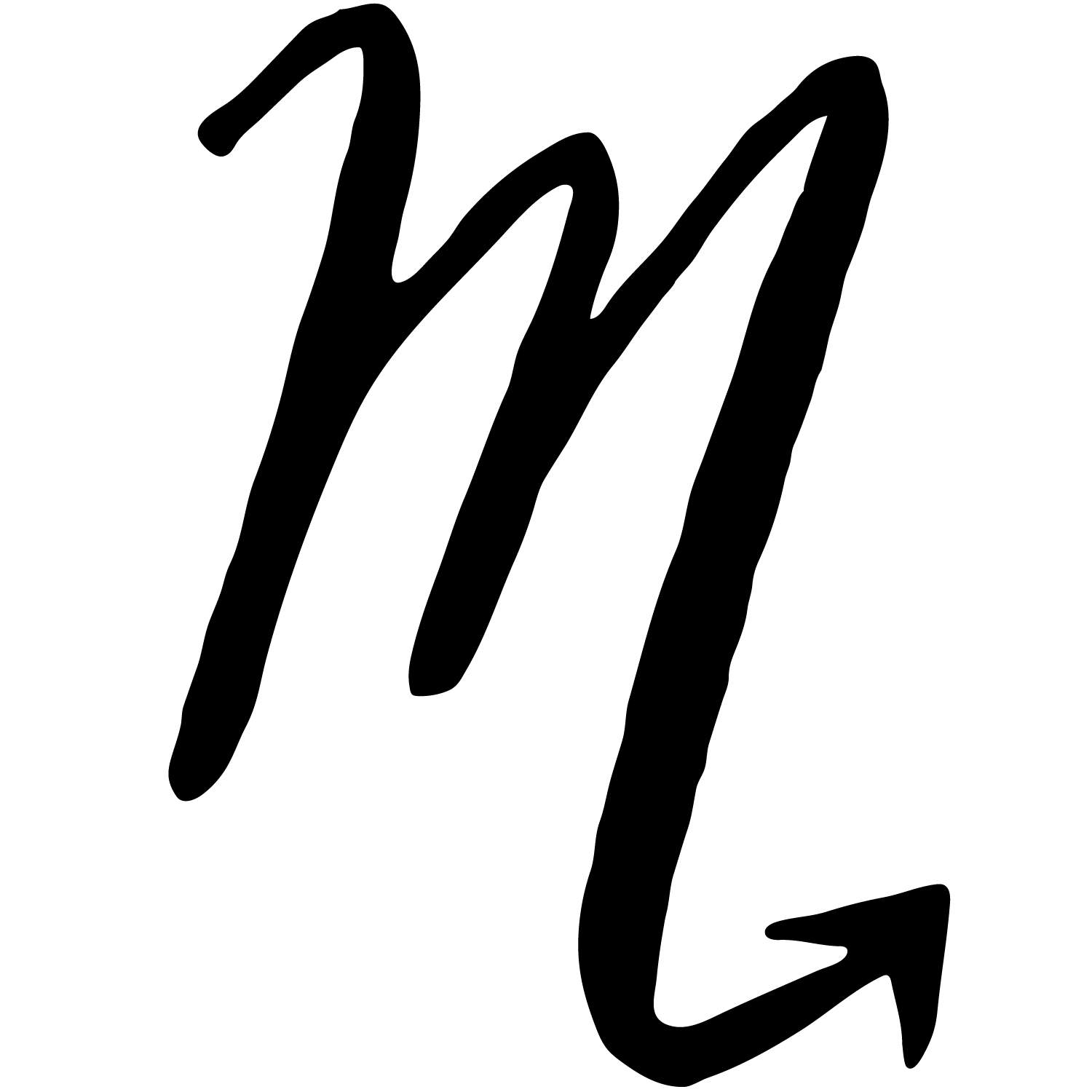
Graphic Designer & Illustrator + Scorpio based in San Diego, CA.
My passion is all things design. I want to inspire you to infuse design into your everyday lifestyle so you can design a life you love.
*CATEGORIES*


13 Going on 30 inspired photoshoot for my 30th birthday!